Now that winter has descended, I’m taking a slightly different direction. I still want to get my walking steps done. However, I need to sit down every once in a while to relieve the pressure on my lower back. It’s not a fun time to sit on a snowy bench for 2 minutes.
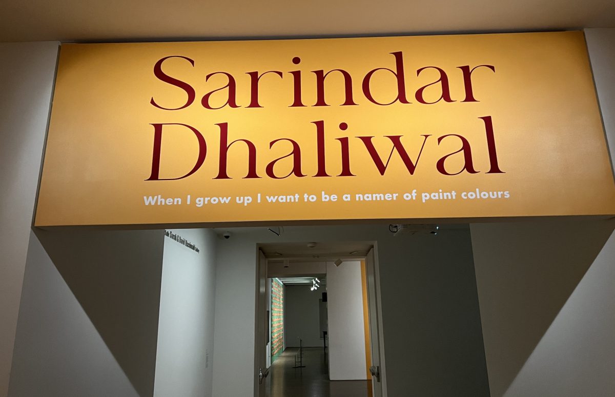
Enter – the Art Gallery of Ontario. A friend on Facebook, David Ramsden, had started going there in December and posted about it. I went and checked out the Sarindar Dahliwal exhibit. It was not only stimulating, but the chairs and benches provided meant I could sit and absorb the colours while feeling great.
Obviously pugs are not allowed in the gallery so no pug pics in this post. Also, I’m keeping the time limit to under 2 hours. In that way I can use the TTC free transfer.
Sarindar was born in the Punjab, India but emigrated to England with her family at the age of four. The family then came to Canada when she was 15. In this 4 minute video, she describes her artistic approach.
The exhibition is entitled “When I grow up I want to be a namer of paint colours”. The title is apt. As she explains in the video, she has been intrigued with combining text, stories and painting.
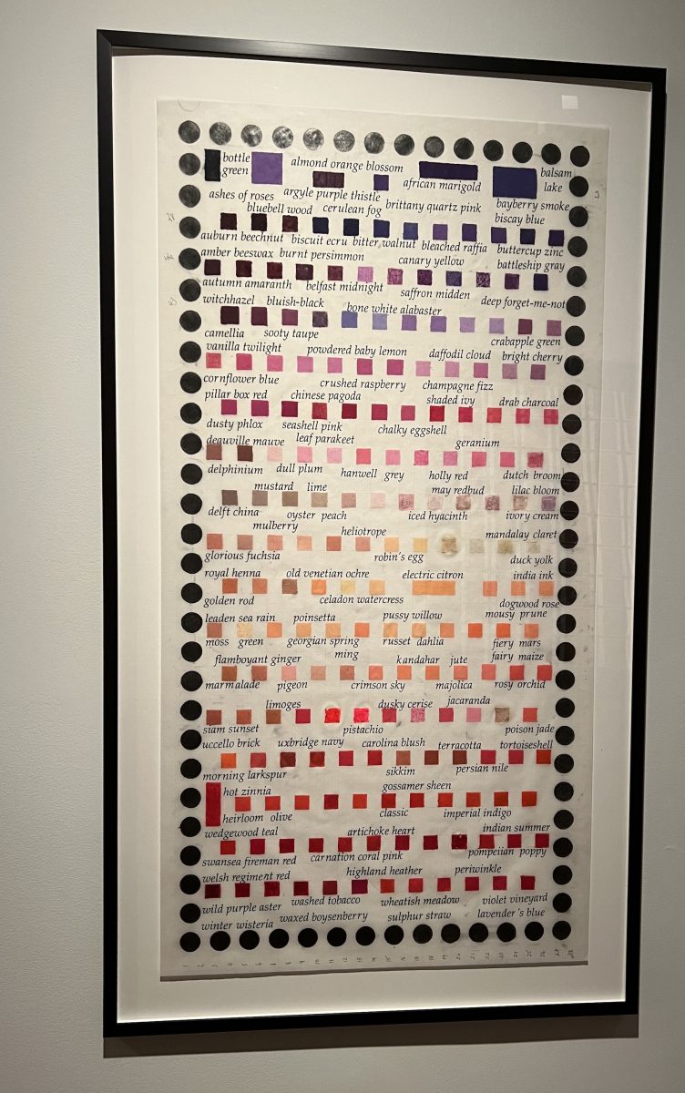
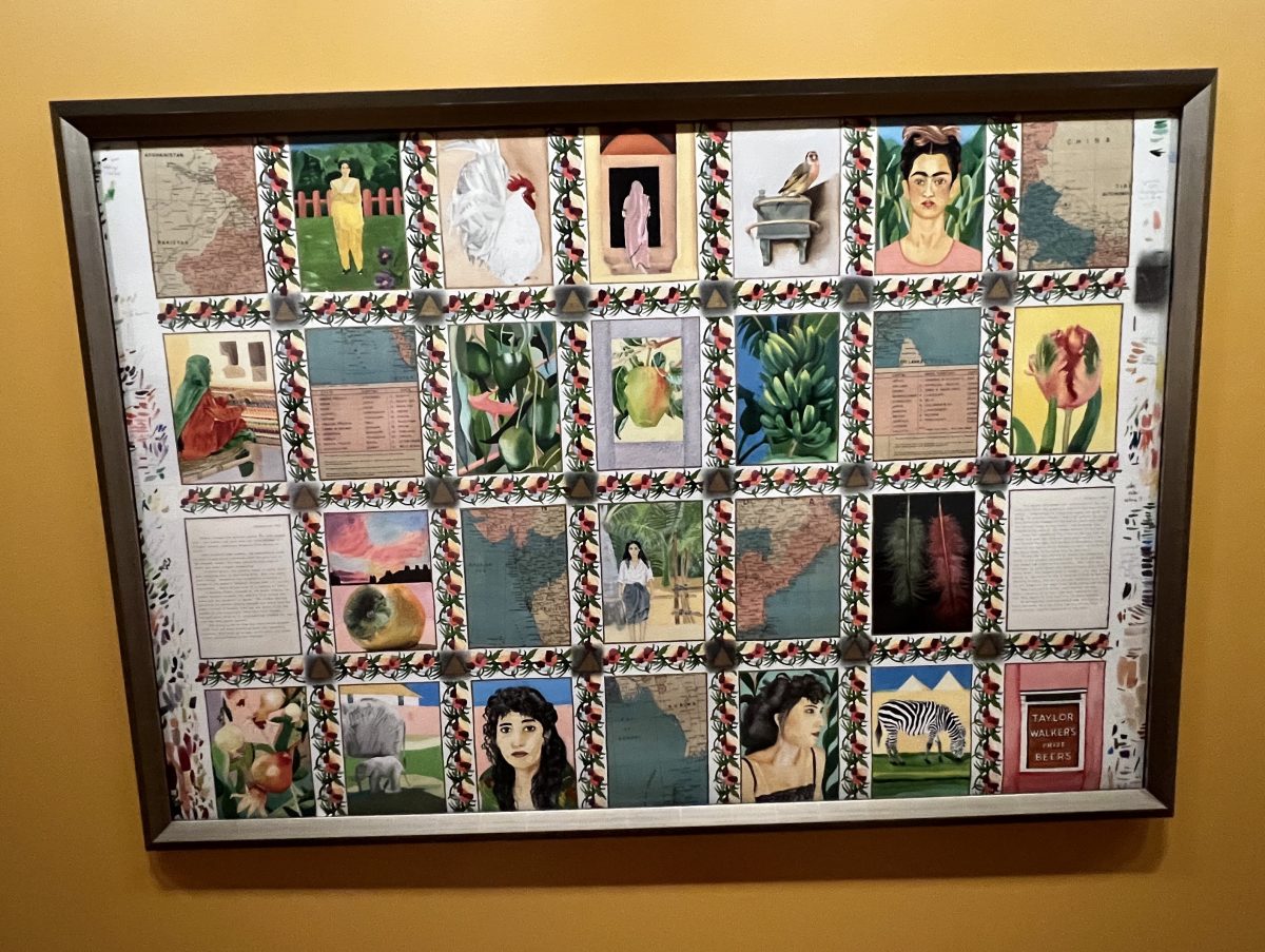
For me, this was most exemplified in the titled piece – “When I grow up I want to be a namer of paint colours” 2010. As you can see, the names of the colours don’t match the colours – “almond” or “orange blossom” are shades of purple. When I first looked at it, I was confused. Then a big smile came to my face as I realized what she was doing – it is quite cheeky.
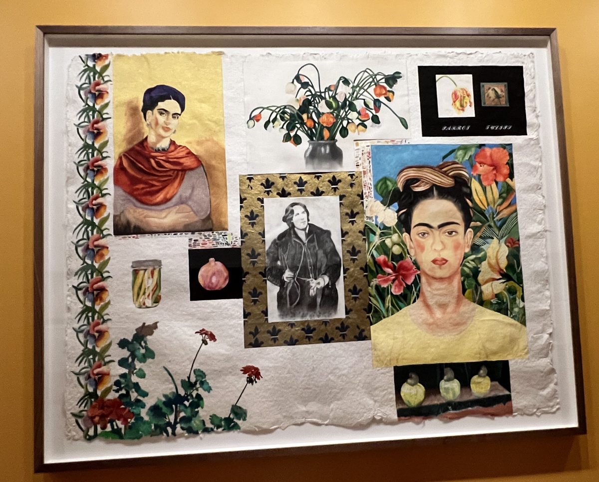
And, of course, I wasn’t surprised by the cheek. One of her inspirations is Oscar Wilde – just about the cheekiest writer you could read. He is represented in the piece “Oscar and Two Friends” 1990. It also includes her other influence – the Mexican painter Frida Khalo and her vibrant use of colour.
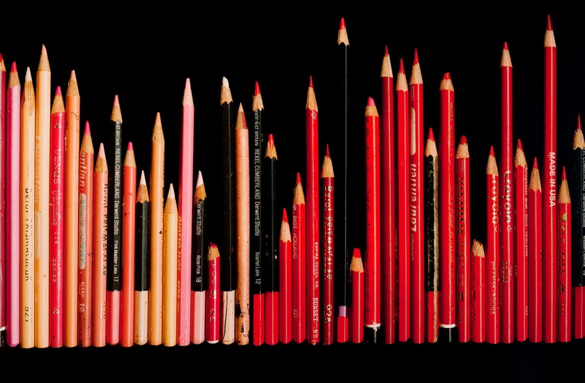
The glorious celebration of colour is the most evident in “Southhall: Childplay” 2009 – a collection of her coloured pencils, laid side by side in a row. They are collected by colour and form a striking palette along the wall.
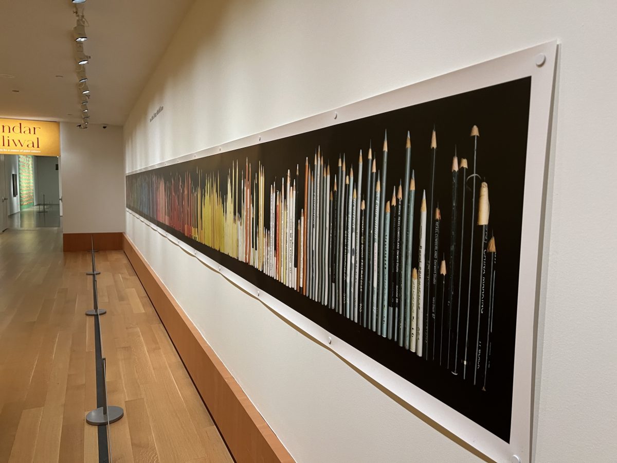
They have been collected together – since her childhood when the family moved to Southhall, England. “If a pencil was blunt, it was sick, off work, and had to go to the hospital which was the pencil sharpener”. Scratched, long, short, blunt or sharpened, I walked slowly along the wall to observe them blending into one another.
Need to rest and there was a little room with a video playing that Sarindar had created “olive, almond & mustard”, 2010. “The film examines the relationship between mother and daughter as they are locked in a battle of wills; the child’s desire to assimilate into the culture of her adopted homeland at odds with her mother…”
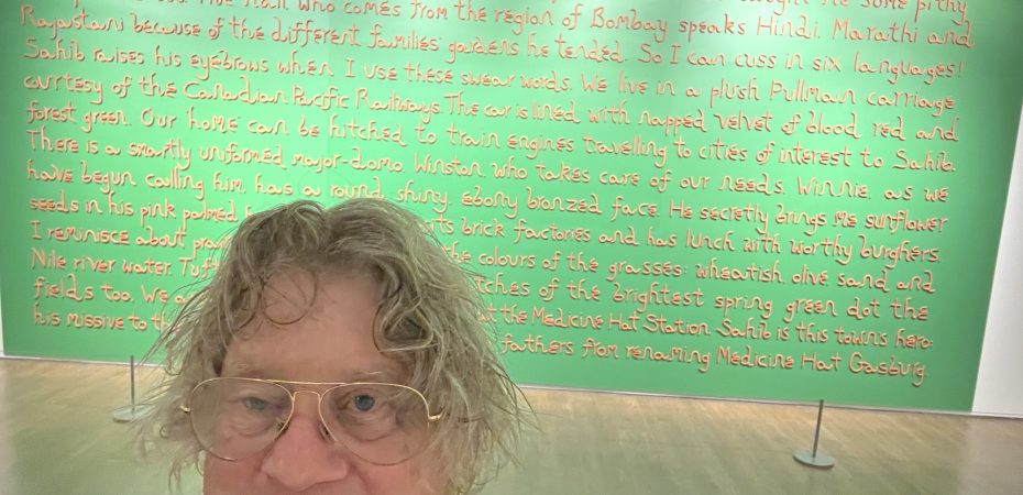
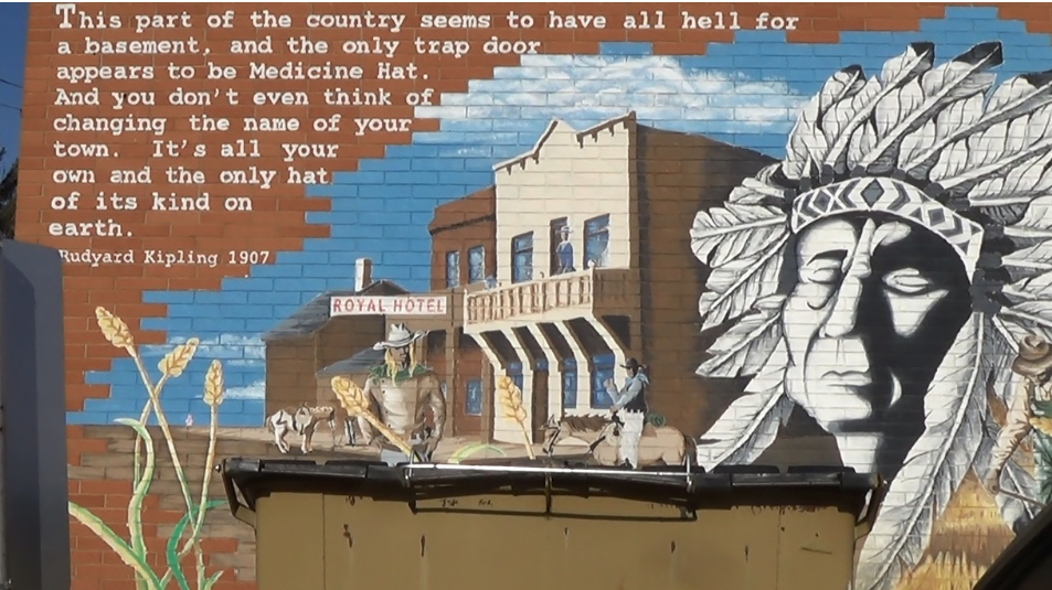
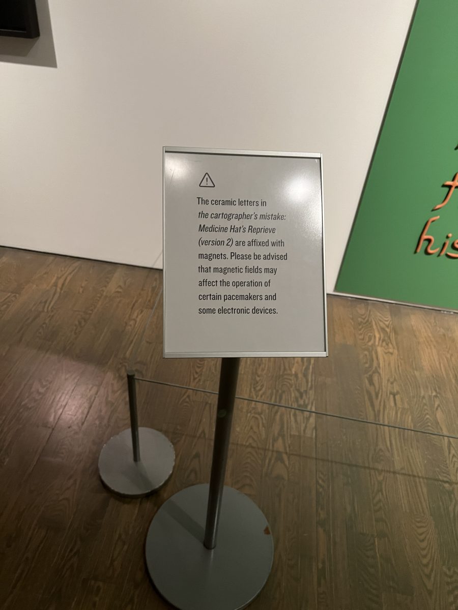
“the cartographer’s mistake: Medicine Hat’s Reprieve (version 2)” 2020. I’ll explain the title shortly. However there was a soft, cushiony bench in front of this so I spent about 15 minutes exploring it. The piece is another excellent example of story and visual. The cartographer is Cyril Radcliffe, the man who drew the seemingly, arbitrary partition lines between Pakistan and India in 1948. The drawing of the line was the mistake. In this fictionalized story, Radcliffe is turned into a parrot because of his mistake.
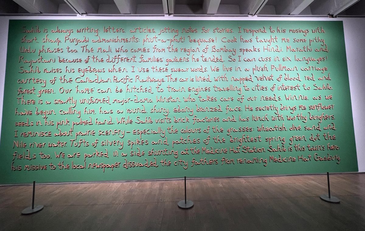
The “sahib” he is talking to is Rudyard Kipling. Kipling visited Medicine Hat, Alberta because he was instrumental in the naming of that city. This is mentioned in the last sentence.
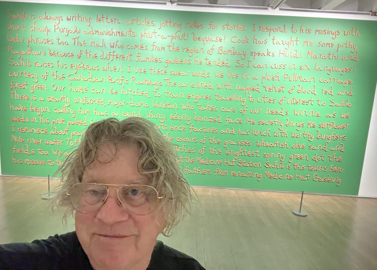
I wrote about this in my travel blog when I visited Medicine Hat with the pugs. City officials were going to change the name but they wrote to Kipling to get his opinion. I took a photo of the mural that describes his response.
The piece is made up of 227 words made of 1,129 ceramic, hand made characters. It was done while Sarindar was artist in residence in Medicine Hat. The characters are magentic and stick to the canvas. There is a warning posted.
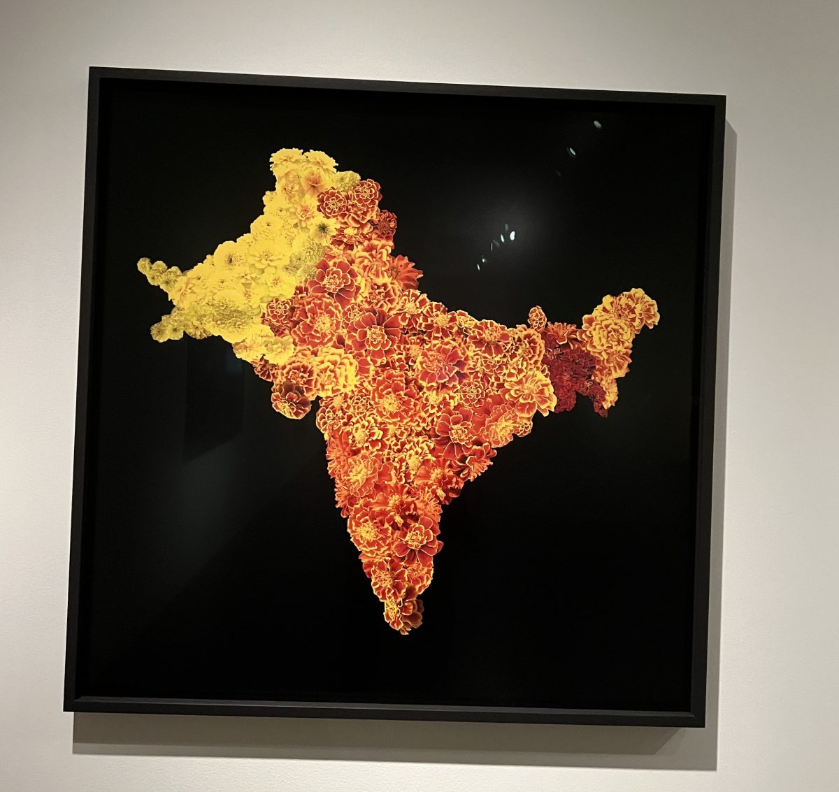
Another piece from the cartographer’s mistake series is “the Radcliffe Line” 2012. Cyril Radcliffe had never visited India. In making the partition of Pakistan, India and Bangladesh, he was influenced by politicians who wanted the separation based on religious lines.
She uses hues of marigold “the rose of India” to distinguish the 3 countries. “I can respond to colonial histories with a critical approach that maintains reverence for wonder and imagination, so that I may return beauty to the world.”
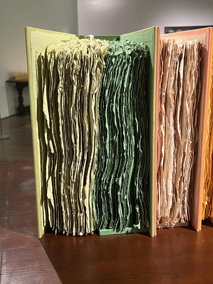
Being an avid book reader, from the bench I turned to a collection of coloured “books” entitled “the green fairy storybook” 2009. Got up to read the titles on the spines and got a chuckle. It took me a minute to understand how the text flowed from left to right on each spine. While stopping at each spine, I admired the colour chosen for that book.
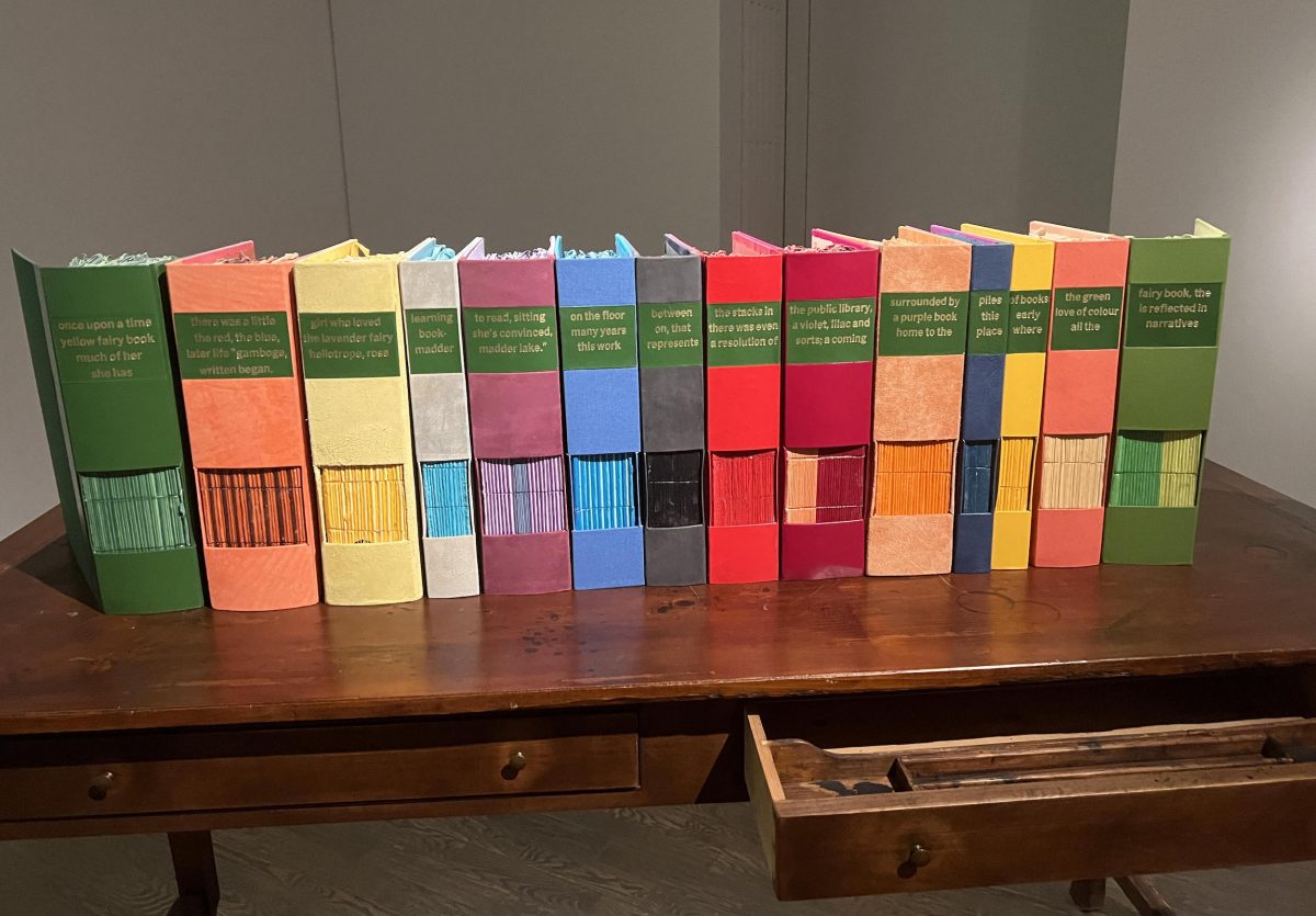
I had to get a close up look at the “pages”.
“Triple Self-Portrait with Persimmon and Pomegranates” 1988 is an early work that establishes her love of colour. It is a rejection of the minimalist approach of her art school experience. (Going to have to practice aligning the frame).
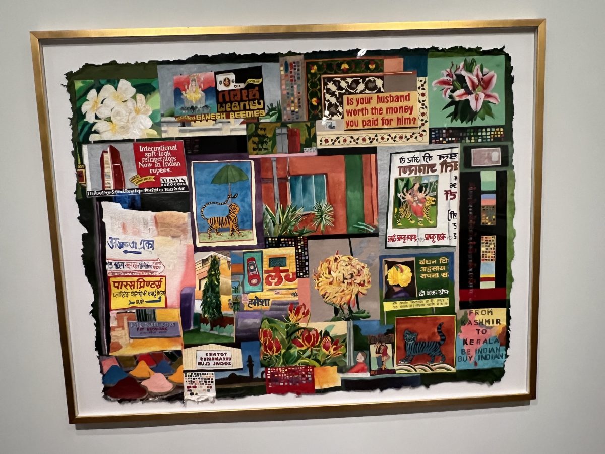
The last piece I’ll describe (there were more in the exhibit) is “Indian Billboard” 2000. Sarindar’s eye caught the feminist billboard which cheekily questioned the dowry system “Is your husband worth the money you paid for him?”. Not knowing Hindi, she wrote the words of the billboard backwards. She then wrote the English billboard words backwards making for a second look at that billboard.
I headed to the Espresso Bar. It is at the south end, next to the historic Grange building. In fact the Grange is a Member’s Lounge featuring a luncheon menu. I’ll check it out the next time I come.
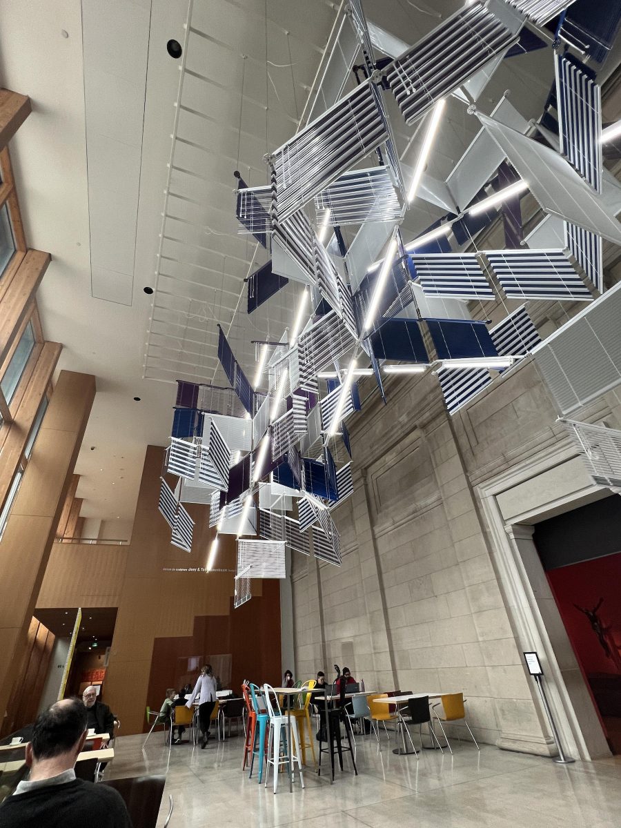
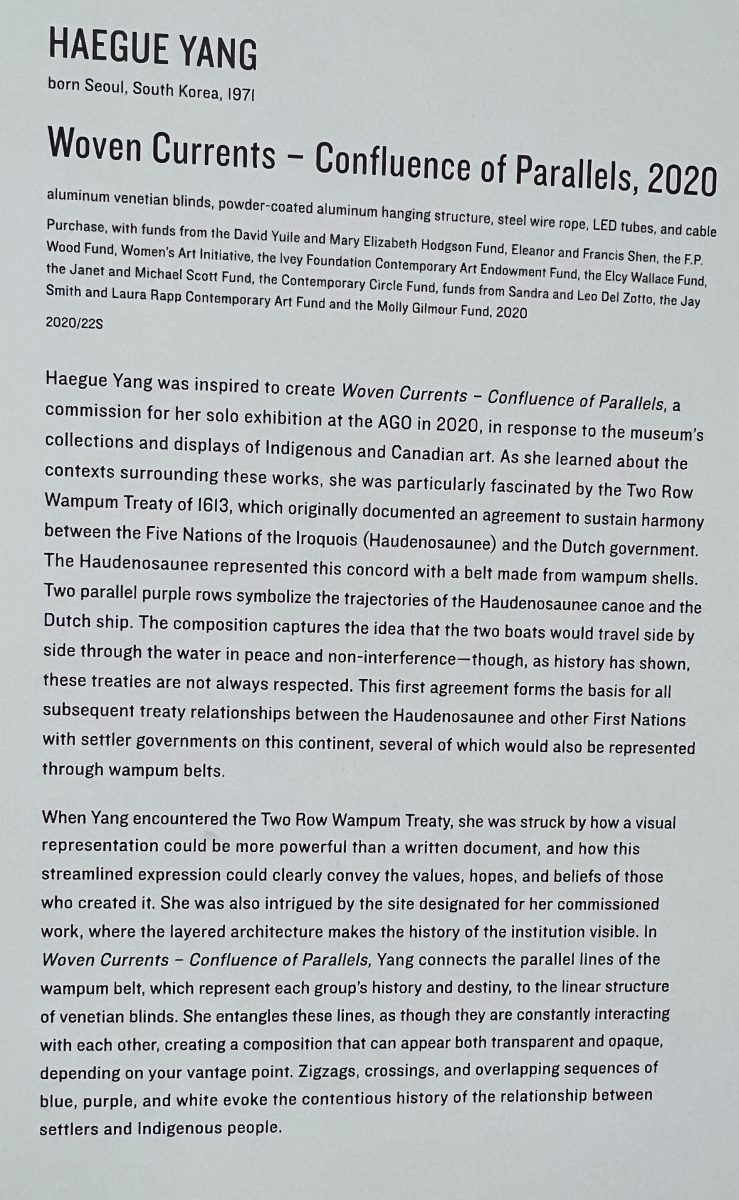
In the meantime, there is a sculpture in the coffee area “Woven Currents – Confluence of Parallels”, 2020 by South Korean artist Haegue Yang. She created this for her solo exhibition at the AGO. It was inspired by the Two Row Wampum Treaty between the Iroquois and the Dutch.
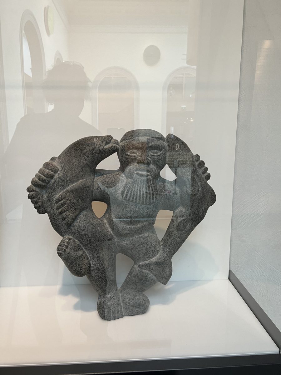
As I was heading to the exit, I just could not help myself. Stopped to view some Inuit soapstone carvings. I see I’m going to have a lot to contemplate here over the next few months. “Man with Fish and Seal”, 1974 by Aqjangajuk Shaa – mottled grey stone.
Next week I’m going to experience the Keith Haring exhibit. So much fun.
Thanks for sharing this eith us Larry! Great read!
Thanks Kathleen. I’m looking forward to many visits to the AGO over the winter. Too bad I can’t bring Eve but I give her a good walk before I leave.
Thank you for sharing, it’s been years since I’ve been to the AGO
Same for me Jean. That’s why it’s such a joy now – like seeing it for the first time.